Pantone Color Paint
Pantone Color Paint: Everything You Need to Know About Perfect Color Matching
Are you tackling a design project, renovating a room, or trying to match a specific brand identity? If so, you've probably realized that "red" isn't just "red"—it could be a thousand different shades. That's where the power of the Pantone Matching System comes in, especially when we talk about **Pantone Color Paint**.
Choosing the right color is perhaps the most critical decision in any visual project. But how do you ensure the digital color you see on screen is the exact same color you get on your wall or product? The answer lies in standardization.
This comprehensive guide will walk you through the world of Pantone, explaining why choosing a specific Pantone shade for your paint project ensures unmatched accuracy and consistency, giving your finished product that professional edge.
What Exactly is the Pantone Matching System (PMS)?
The Pantone Matching System (PMS) is essentially the universal dictionary for color. Established by Pantone Inc., it provides a proprietary, standardized palette of numbered color swatches.
Before Pantone, color matching was often a hit-or-miss scenario based on subjective interpretation. Today, PMS allows designers, manufacturers, and paint specialists worldwide to refer to a specific color code (like PMS 18-3838 Ultra Violet) knowing exactly what hue, tint, and shade they are dealing with.
This system removes guesswork from the equation, guaranteeing that the colors used in different materials—be it fabric, plastic, or paint—remain consistent.
The Importance of Color Standardization
Why do we need such strict standardization? For brands, color is identity. Think of Coca-Cola red or Tiffany blue.
If these colors varied even slightly across different advertisements, products, or packaging, the brand identity would be diluted. Pantone ensures that whether you're printing a business card or mixing **Pantone Color Paint** for your retail storefront, the shade is identical.
For interior design, standardization is key to achieving the exact mood or atmosphere intended by the designer. You want the deep, rich tone you selected, not a close approximation.
How Pantone Translates to Physical Paint
Pantone primarily works in the print and digital realm, but modern technology has made it seamless to cross-reference these codes with physical paint formulas. Major paint manufacturers have developed sophisticated systems to convert PMS codes into precise paint recipes.
When you ask for a Pantone paint color, the retailer uses specific spectrophotometers and software. These tools measure the color's reflection spectrum and then calculate the exact ratio of pigments (tints, bases, and colorants) needed to achieve that specific, highly accurate color.
Why Choose Pantone Color Paint for Your Project?
You might be wondering if going through the trouble of specifying a Pantone code is truly necessary when there are thousands of standard paint chips available. The answer is yes, especially if accuracy and consistency are your top priorities.
Using **Pantone Color Paint** offers several distinct advantages over standard off-the-shelf colors:
- Unparalleled Accuracy: You eliminate the subjective interpretation of color names (e.g., is "Sky Blue" light or dark?). A Pantone code is a definitive formula.
- Design Consistency: If your project involves multiple mediums (printed brochures, digital assets, and painted walls), using PMS ensures everything aligns perfectly.
- Professional Results: Clients and customers recognize the precision. Using Pantone conveys a commitment to quality and detail, making your project look truly polished.
- Easier Recalibration: Need to touch up the paint a year later? As long as you have the Pantone code, you can easily get the exact same shade mixed, avoiding the headache of faded or discontinued standard chips.
The Process: Getting Your Perfect Pantone Shade Mixed
Mixing a specific Pantone shade requires a methodical approach. It's not as simple as pointing to a swatch and hoping for the best. Here is the step-by-step process you should follow to ensure color perfection.
Finding Your Pantone Code
First and foremost, you need the official code. This usually comes from a physical Pantone Formula Guide or a digital design file.
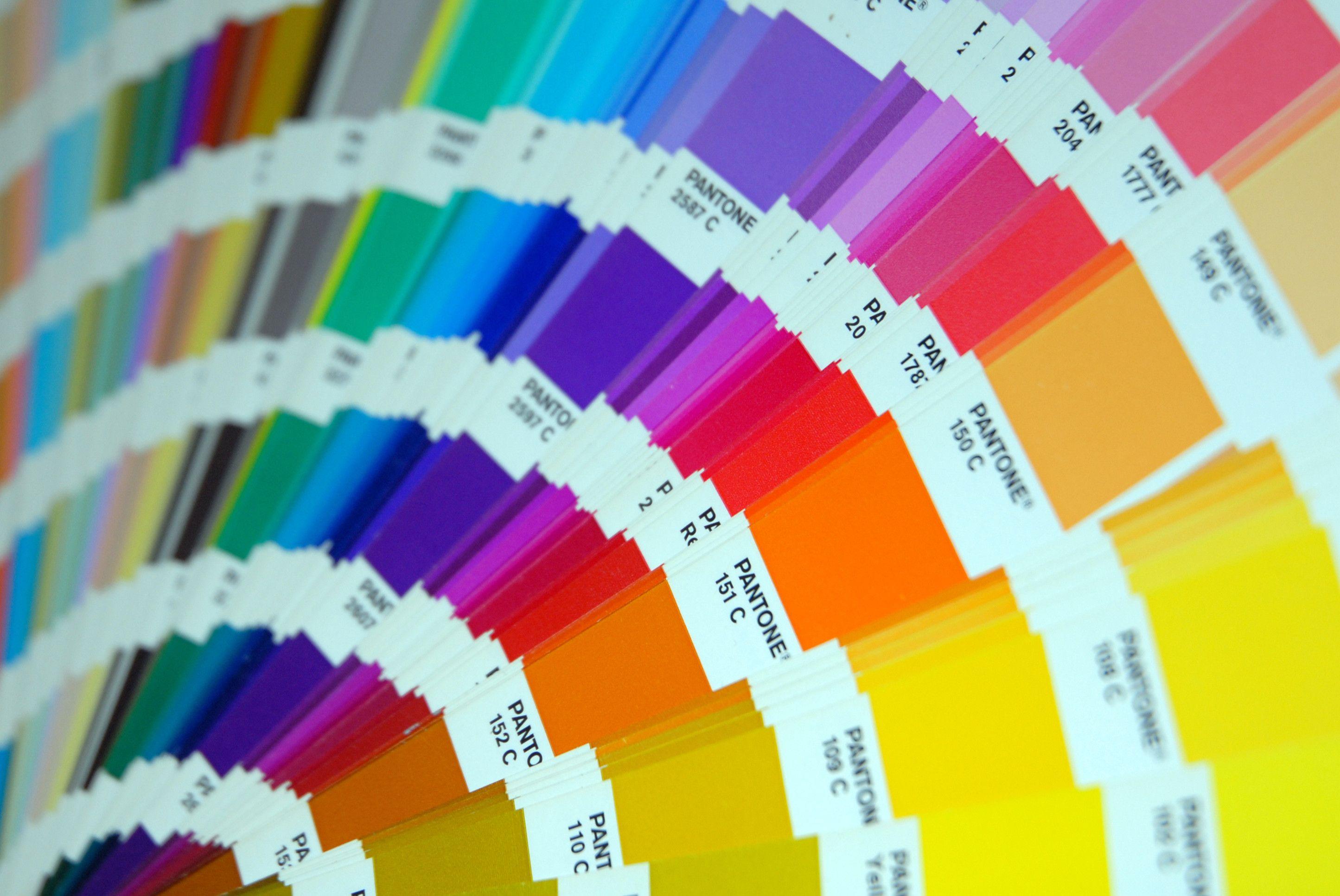
The code typically includes the color number followed by a suffix. The most common suffixes you will encounter are "C" (Coated), "U" (Uncoated), and "TPX" or "TCX" (Textile or Cotton, often used for home decor).
- Identify the Specific System: Ensure you know whether you are using the Graphics system (for print/digital) or the Fashion, Home + Interiors (FHI) system, as the formulas and conversion will differ.
- Check the Code: Write down the full alphanumeric code precisely (e.g., PMS 186 C).
- Verify Conversion: Some paint suppliers may require you to cross-reference the Pantone code to their internal color system, although many modern retailers can mix directly from the official PMS number.
Key Considerations Before Buying
Before you commit to gallons of **Pantone Color Paint**, there are a few practical factors to consider that will affect the final result.
Even the most accurate color formula can look different depending on the surrounding environment and application method.
- Lighting Matters: Colors appear drastically different under natural light compared to fluorescent or LED light. Always test a sample under the light conditions of the final space.
- Substrate Effect: The material being painted (the substrate) can influence the final color. Porous materials absorb paint differently than smooth, sealed surfaces.
- Sheen Level: The glossiness of the paint (matte, semi-gloss, high-gloss) changes how light reflects off the surface, making the same color code appear lighter or darker. Always specify the desired sheen with your Pantone code.
- Base Compatibility: Dark, vibrant Pantone colors often require a deep or clear base, which can sometimes be more expensive than standard white bases.
Common Misconceptions About Pantone Paint
While Pantone offers incredible precision, it's not a magic bullet. There are a few things people often misunderstand about using this system for architectural coatings.
Firstly, not all Pantone colors can be perfectly replicated in paint. Some highly saturated, fluorescent, or metallic colors rely on specialized pigments that simply cannot be replicated using standard architectural paint bases.
Secondly, "Pantone paint" isn't a specific brand of paint; it is a color formula. You are getting your chosen brand (like Benjamin Moore or Sherwin-Williams) mixed to a Pantone specification.
Finally, always remember that digital representations (like the colors you see on your monitor) can vary widely due to screen calibration. Rely on physical swatches or chips whenever possible for final verification.
Conclusion: Achieving Color Perfection with Pantone
Whether you are a professional designer or a DIY enthusiast aiming for absolute color integrity, utilizing a specific Pantone code for your project is the way to go. It eliminates ambiguity, guarantees consistency, and elevates your results from amateur to professional.
By understanding the system, verifying your codes, and considering the application environment, you can confidently utilize **Pantone Color Paint** to bring your vision to life with perfect accuracy. Don't settle for "close enough"—demand the exact color you intended.
Frequently Asked Questions (FAQ) About Pantone Color Paint
- Can I get any Pantone color mixed into paint?
- While most common Pantone colors can be mixed, highly specialized colors like neons or metallics (which use non-standard pigments) might be difficult or impossible to replicate exactly in standard architectural paint bases.
- Is Pantone Color Paint more expensive than standard paint?
- The cost of the paint base itself is generally the same. However, requesting a custom Pantone mix might sometimes incur a slightly higher mixing fee, and very deep, vibrant Pantone colors often require expensive clear bases.
- Do I need to convert the Pantone code to a paint brand's code?
- It depends on the retailer. High-end paint suppliers often have conversion software that accepts the direct PMS code. If using a local hardware store, they may need you to use a physical fan deck to cross-reference the color, or they might ask for the nearest standard color equivalent.
- What is the difference between Pantone C and U?
- The "C" stands for Coated (paper stock typically used for glossy prints) and "U" stands for Uncoated (matte paper stock). Because the substrate affects the color appearance, the pigment formulas are slightly different to ensure the color looks consistent across both finishes. For paint, you should ideally use the FHI (Fashion, Home + Interiors) codes, but paint mixers typically convert from C or U using the most accurate conversion possible.
Pantone Color Paint
Pantone Color Paint Wallpapers
Collection of pantone color paint wallpapers for your desktop and mobile devices.

Vivid Pantone Color Paint Scene Photography
Transform your screen with this vivid pantone color paint artwork, a true masterpiece of digital design.

Gorgeous Pantone Color Paint Wallpaper for Desktop
This gorgeous pantone color paint photo offers a breathtaking view, making it a perfect choice for your next wallpaper.

Dynamic Pantone Color Paint Moment Concept
A captivating pantone color paint scene that brings tranquility and beauty to any device.

Crisp Pantone Color Paint Design Collection
A captivating pantone color paint scene that brings tranquility and beauty to any device.
Stunning Pantone Color Paint Scene in 4K
A captivating pantone color paint scene that brings tranquility and beauty to any device.

Detailed Pantone Color Paint Landscape for Mobile
Discover an amazing pantone color paint background image, ideal for personalizing your devices with vibrant colors and intricate designs.
Detailed Pantone Color Paint View Nature
Transform your screen with this vivid pantone color paint artwork, a true masterpiece of digital design.
Stunning Pantone Color Paint Capture in 4K
This gorgeous pantone color paint photo offers a breathtaking view, making it a perfect choice for your next wallpaper.

Beautiful Pantone Color Paint Image Concept
Transform your screen with this vivid pantone color paint artwork, a true masterpiece of digital design.
Beautiful Pantone Color Paint Photo Collection
Experience the crisp clarity of this stunning pantone color paint image, available in high resolution for all your screens.

Amazing Pantone Color Paint Design in 4K
Transform your screen with this vivid pantone color paint artwork, a true masterpiece of digital design.

Amazing Pantone Color Paint Abstract Digital Art
Experience the crisp clarity of this stunning pantone color paint image, available in high resolution for all your screens.

Amazing Pantone Color Paint Picture Collection
Transform your screen with this vivid pantone color paint artwork, a true masterpiece of digital design.
Vibrant Pantone Color Paint Scene in 4K
Experience the crisp clarity of this stunning pantone color paint image, available in high resolution for all your screens.
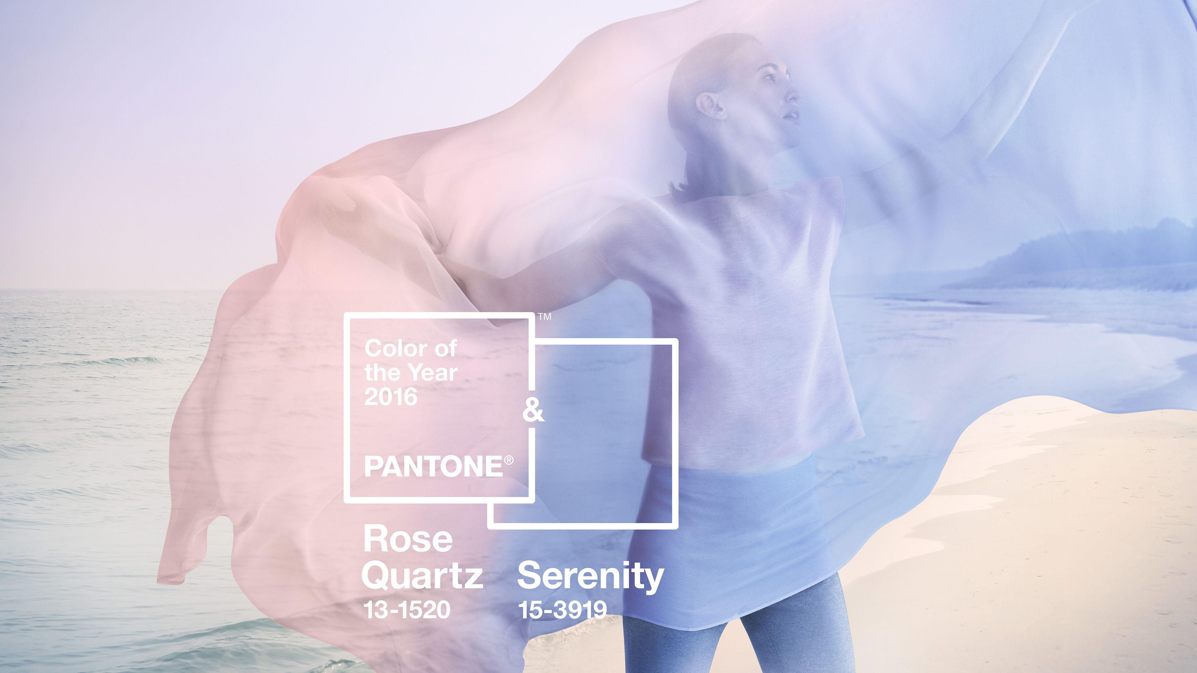
Crisp Pantone Color Paint Landscape Collection
A captivating pantone color paint scene that brings tranquility and beauty to any device.

Lush Pantone Color Paint Moment for Mobile
A captivating pantone color paint scene that brings tranquility and beauty to any device.

Exquisite Pantone Color Paint Wallpaper Illustration
Immerse yourself in the stunning details of this beautiful pantone color paint wallpaper, designed for a captivating visual experience.
Stunning Pantone Color Paint Artwork in 4K
This gorgeous pantone color paint photo offers a breathtaking view, making it a perfect choice for your next wallpaper.

Vivid Pantone Color Paint Background Nature
Explore this high-quality pantone color paint image, perfect for enhancing your desktop or mobile wallpaper.

Beautiful Pantone Color Paint View Collection
Discover an amazing pantone color paint background image, ideal for personalizing your devices with vibrant colors and intricate designs.
Download these pantone color paint wallpapers for free and use them on your desktop or mobile devices.