Paint Color Comparison Between Brands
Paint Color Comparison Between Brands: Everything You Need to Know Before You Buy
Planning a paint project? Choosing the right color is often the hardest part. You might fall in love with a shade from one brand, only to find a similar color from another brand is significantly cheaper—but are they really the same? The short answer is almost certainly no. Navigating the complexities of a thorough Paint Color Comparison Between Brands requires more than just holding two swatches side-by-side.
We're here to demystify the process. Forget the notion that colors are universal; when it comes to paint, formulations, bases, and pigments create unique results. Let's dive into what makes seemingly identical shades completely different once they hit your walls, ensuring you make an informed decision for your next renovation.
The Myth of Exact Color Matching
One of the most common pitfalls homeowners face is trusting the computer match. While many paint stores offer cross-brand matching services, it is crucial to understand that these machines are only performing a close approximation, not a perfect replication.
Paint companies use proprietary formulas. Sherwin-Williams uses specific binders, pigments, and colorants that differ from those used by Benjamin Moore or Behr. When a machine tries to match Brand A's color using Brand B's components, it can achieve a high degree of visual similarity, but the underlying chemistry will always be different.
Furthermore, color matching relies heavily on a phenomenon called metamerism. Metamerism means that two colors that appear to match under one light source (like the store's fluorescent lights) may look completely different under a different light source (like natural sunlight in your living room). This is a strong reason why relying solely on a digital match is risky business during your Paint Color Comparison Between Brands process.
Understanding Color Systems and Bases
To truly compare colors effectively, you need to look beyond the pretty chip. You need to understand the science behind how these colors are mixed and standardized. Different brands utilize various color systems, such as L*a*b* (Luminosity, Red/Green axis, Blue/Yellow axis) or even RGB values, though these are rarely directly visible to the consumer.
The base paint itself also plays a massive role. The quality of the resins and binders in the base determines how the colorants interact and how the final color dries. Cheaper bases may absorb light differently than premium bases, altering the perceived hue and saturation.
When you are looking at a Paint Color Comparison Between Brands, consider the following base differences:
- Sheen Level: A flat paint absorbs light, making colors look richer and deeper. A semi-gloss or high-gloss paint reflects light, which can make the same color appear lighter and brighter.
- Opacity: Higher quality paints often have better hiding power (opacity) due to superior titanium dioxide levels. This allows the true color to show up with fewer coats, and the final look is less influenced by the underlying primer or wall color.
- Colorant Load: Each brand has limits on how much colorant can be added to the base without compromising the paint's integrity. Some colors require more colorant than others, and the brand's specific colorant formulas impact the result.
Decoding Brand-Specific Naming Conventions
One brand's "Pale Linen" might be another brand's "Soft Cotton." Paint names are designed to evoke an emotion or a feeling, but they offer zero technical information about the actual color composition. This is especially true for popular neutrals, where every company tries to stake a claim on the perfect off-white or greige.
If you love a color from one brand and want to find a close alternative, do not search by name. Instead, look for the technical color code or, if available, the L*a*b* values. Alternatively, search online forums and design blogs where experts have already done the legwork to find common cross-references between the major players.
Key Differences in Brand Palettes
While all major brands carry a wide range of colors, they often develop a "signature style" in their offerings. This is a subtle yet crucial factor in Paint Color Comparison Between Brands.
For instance, some brands are known for having slightly cleaner, more modern colors, often emphasizing true whites and blues. Other brands might specialize in historic palettes, which lean heavily on muted tones and complex, earthy colors that shift beautifully in changing light.
When you are comparing, try to detect the subtle underlying bias of the brand. Are their grays consistently leaning purple? Do their whites always have a hint of yellow? Knowing the brand's preference can help you narrow down your search efficiently.
Analyzing Undertones and Lighting
The true magic—and terror—of paint comparison lies in the undertone. An undertone is the subtle hue you might not notice until the paint is applied to a large surface and viewed in different light sources. Two seemingly identical beige paints can have wildly different undertones, making one feel cozy and the other feel sickly green.
When comparing paint chips, always look at the darkest color on the same strip. This darkest shade often reveals the true undertone of the lighter shades. Furthermore, always bring samples home to view them:
- In natural daylight (north, south, east, or west exposure).
- Under artificial light (incandescent, LED, or fluorescent).
- At different times of day (morning, noon, and evening).
Understanding how the undertone reacts to your unique lighting environment is far more important than achieving a perfect digital match between brands.
Tips for Successful Paint Color Comparison Between Brands
Ready to get hands-on? Here are the best practical steps to ensure you choose the perfect shade without any expensive surprises.
You cannot simply trust a tiny swatch from a different brand. The investment of time and a little bit of money now will save you countless headaches later when you realize your entire living room is unintentionally mint green.
- Gather Large Swatches: Request or purchase the largest physical swatches available from both brands you are considering. A 2x2 inch chip is deceiving. Look for samples that are at least 8x10 inches.
- Test Side-by-Side Against a True White: Always place your color samples against a clean, white background (like a piece of bright white printer paper) to neutralize your perception. This highlights the undertones instantly.
- Don't Cross-Match Immediately: If you love a color from Brand A, buy the sample pot from Brand A first. If that paint is too expensive for the volume you need, then look for alternatives in Brand B, rather than relying on an immediate computerized cross-match.
- Check the Light Reflectance Value (LRV): The LRV number indicates how much light a color reflects. If Brand A's color has an LRV of 68, look for Brand B's colors that also fall between 65 and 70. This ensures the perceived lightness is similar, even if the hue is slightly off.
The Power of Sample Pots
There is absolutely no replacement for purchasing a sample pot (typically a quart size) and painting a large test patch on your actual wall. If you are comparing two specific colors from two different brands, paint a 2ft x 2ft square of each color side-by-side.
Crucially, do not paint the sample directly onto a colored wall, as the existing color will severely skew your perception. Use a primer first, or paint onto large pieces of poster board and move those around the room.
Conclusion
Successfully navigating a Paint Color Comparison Between Brands is less about finding a perfect copy and more about understanding the nuances of color formulation, undertones, and light. No two brands are identical, even if their color chips seem close, due to proprietary pigments and base materials.
By focusing on analyzing undertones, checking the LRV, and, most importantly, testing large samples in your space, you can move past the initial confusion and select a beautiful, long-lasting color that truly complements your home. Don't rush the sampling process—it's the most important step in achieving your perfect look.
Frequently Asked Questions (FAQ) About Paint Color Comparison
- Can I bring a swatch from one brand to another store for an exact match?
- You can, but it is highly unlikely to be an *exact* match. Paint stores use spectrophotometers to analyze the color, but they must recreate it using their own, proprietary colorants and base formulas. The resulting color will be a very close approximation, but differences in sheen, undertone, and how the color wears over time may be noticeable.
- Why does the color I chose look different on my wall than on the small swatch?
- This is typically due to two factors: scale and light. When a tiny amount of color is viewed on a massive wall, the intensity is amplified. Additionally, your interior lighting (natural sunlight, lamps, shadows) dramatically alters how the color is perceived, often pulling out subtle undertones you didn't notice on the chip.
- Is a more expensive paint brand always better for color accuracy?
- While premium brands generally use higher quality pigments and binders that lead to truer, more vibrant colors and better durability, "better" is subjective. If you find a color you love in a budget brand and it performs adequately for your needs, that is the best paint for your project. However, premium paints often offer greater depth and complexity of color.
- What is LRV and why is it important for paint comparison?
- LRV stands for Light Reflectance Value. It is a measurement (from 0 to 100) that indicates the percentage of visible and usable light that is reflected from a painted surface. Black is 0 and pure white is 100. Comparing LRV helps you determine how light or dark a color from one brand is relative to a similar color from another brand, ensuring your final choice provides the desired brightness.
Paint Color Comparison Between Brands
Paint Color Comparison Between Brands Wallpapers
Collection of paint color comparison between brands wallpapers for your desktop and mobile devices.
Dynamic Paint Color Comparison Between Brands Photo for Your Screen
Find inspiration with this unique paint color comparison between brands illustration, crafted to provide a fresh look for your background.

Exquisite Paint Color Comparison Between Brands View for Desktop
This gorgeous paint color comparison between brands photo offers a breathtaking view, making it a perfect choice for your next wallpaper.

Spectacular Paint Color Comparison Between Brands Landscape for Desktop
A captivating paint color comparison between brands scene that brings tranquility and beauty to any device.

Gorgeous Paint Color Comparison Between Brands Photo Art
This gorgeous paint color comparison between brands photo offers a breathtaking view, making it a perfect choice for your next wallpaper.

Dynamic Paint Color Comparison Between Brands Capture Art
Find inspiration with this unique paint color comparison between brands illustration, crafted to provide a fresh look for your background.
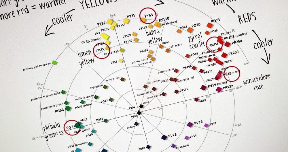
Detailed Paint Color Comparison Between Brands Design in HD
Transform your screen with this vivid paint color comparison between brands artwork, a true masterpiece of digital design.
Vivid Paint Color Comparison Between Brands Wallpaper for Mobile
Experience the crisp clarity of this stunning paint color comparison between brands image, available in high resolution for all your screens.

Crisp Paint Color Comparison Between Brands Wallpaper in HD
Immerse yourself in the stunning details of this beautiful paint color comparison between brands wallpaper, designed for a captivating visual experience.
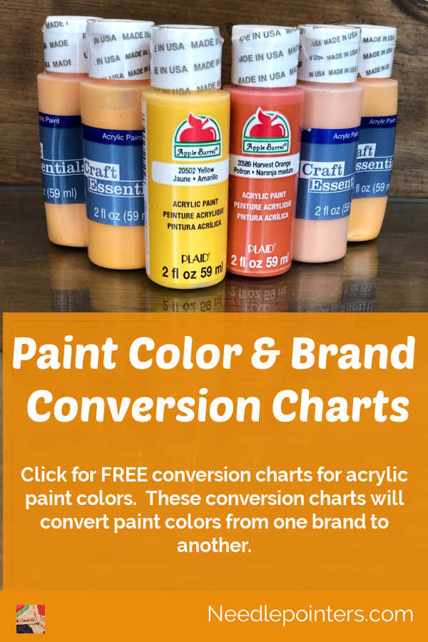
Beautiful Paint Color Comparison Between Brands Abstract Collection
Discover an amazing paint color comparison between brands background image, ideal for personalizing your devices with vibrant colors and intricate designs.

Exquisite Paint Color Comparison Between Brands Scene in 4K
This gorgeous paint color comparison between brands photo offers a breathtaking view, making it a perfect choice for your next wallpaper.
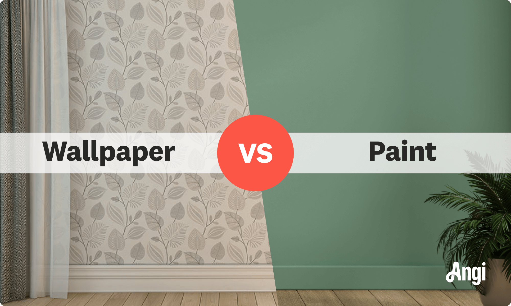
Artistic Paint Color Comparison Between Brands Image for Your Screen
A captivating paint color comparison between brands scene that brings tranquility and beauty to any device.
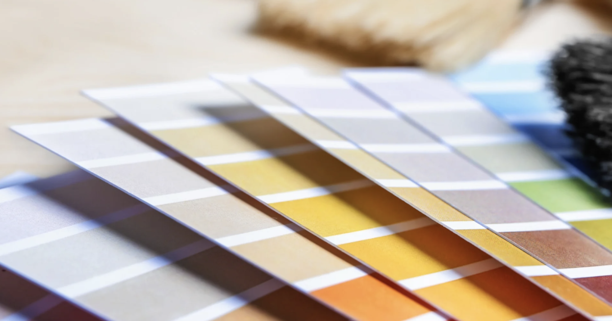
Lush Paint Color Comparison Between Brands Photo in HD
This gorgeous paint color comparison between brands photo offers a breathtaking view, making it a perfect choice for your next wallpaper.

Stunning Paint Color Comparison Between Brands Artwork Nature
This gorgeous paint color comparison between brands photo offers a breathtaking view, making it a perfect choice for your next wallpaper.

Beautiful Paint Color Comparison Between Brands Moment for Mobile
Transform your screen with this vivid paint color comparison between brands artwork, a true masterpiece of digital design.

Beautiful Paint Color Comparison Between Brands Abstract Illustration
Explore this high-quality paint color comparison between brands image, perfect for enhancing your desktop or mobile wallpaper.

Spectacular Paint Color Comparison Between Brands Landscape Collection
Find inspiration with this unique paint color comparison between brands illustration, crafted to provide a fresh look for your background.
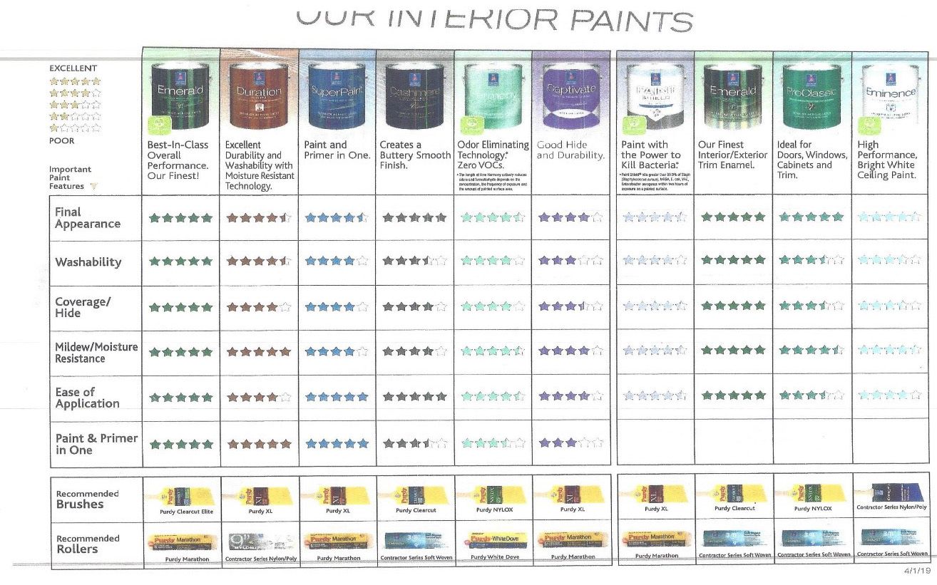
Detailed Paint Color Comparison Between Brands Picture Art
Transform your screen with this vivid paint color comparison between brands artwork, a true masterpiece of digital design.
Amazing Paint Color Comparison Between Brands Wallpaper Concept
Discover an amazing paint color comparison between brands background image, ideal for personalizing your devices with vibrant colors and intricate designs.
Amazing Paint Color Comparison Between Brands Scene for Mobile
Discover an amazing paint color comparison between brands background image, ideal for personalizing your devices with vibrant colors and intricate designs.

Vibrant Paint Color Comparison Between Brands Wallpaper in 4K
Experience the crisp clarity of this stunning paint color comparison between brands image, available in high resolution for all your screens.
Download these paint color comparison between brands wallpapers for free and use them on your desktop or mobile devices.